
What Is a Linkable Card? A Complete Guide for Websites
A linkable card is a card-shaped web element that gives users a compact preview of content and lets them navigate to another page or resource. It is commonly used to present related articles, products, services, resources, categories, or other destinations without relying on a plain text link.
The term can vary across design systems. Some platforms call it a link card, while others use terms such as image card or content card. The underlying idea is similar: information is grouped into a visual container, and the card provides a clear path to another URL. The W3C Design System, for example, describes both simple cards with a distinct link and block link cards where the card surface can function as a link.
What Is a Linkable Card?
A linkable card combines a small amount of content with a navigation action.
A typical card may contain a title, a short description, an image or icon, and a link. The destination can be another page on the same website or an external resource. Some implementations make only the title or CTA clickable, while others allow most or all of the card surface to act as the link.
For example, a technology website might display three cards below an article. One could link to an AI tools guide, another to a software comparison, and another to a related tutorial. Instead of displaying three ordinary text links, the cards give users a visual preview of what they will find on each destination.
This makes the component useful for both navigation and content discovery.
A linkable card is therefore not simply a box with a hyperlink inside it. Its value comes from how the content, visual hierarchy, and interaction work together.
How Does a Linkable Card Work?
At the basic level, the card points users toward a specific URL.
The card first presents enough information to help the visitor understand what is behind the link. The title usually identifies the destination, while a short description adds context. An image or icon may provide additional visual information when it is useful.
When the user selects the card or its main link, the browser follows the associated URL and loads the destination page.
Different implementations handle this interaction in different ways. In some systems, only the heading is an anchor. In others, JavaScript enhances the component so that the wider card area behaves like a link. The W3C Design System documents this distinction and recommends keeping the actual link identifiable in the markup rather than treating the entire card as an undifferentiated clickable element.
Modern component libraries also expose the same basic structure through reusable properties. For example, a LinkCard component can define a title, destination URL, icon, description, and target behavior as separate values.
This makes linkable cards easy to reuse across a website while keeping their content and destination flexible.
🧠 Deepen Your Knowledge: What Is M365? A Simple Guide to Microsoft 365
Where Are Linkable Cards Used?
Linkable cards are especially useful when several related destinations need to be presented together.
A landing page may use them to direct visitors toward important sections. A blog can use them for related articles. A product website can use cards to introduce product categories or individual products. Documentation sites can use them to guide readers toward guides, references, or other sections.
They are also useful when visual context improves the decision to click.
The University of Illinois, for example, uses link cards to highlight important pages and provide visitors with additional context before they navigate to a destination. Its implementation supports a title, short description, optional image, and internal or external links.
The same pattern appears in university and institutional design systems, where image-based link cards are used to organize related pages into visually structured groups.
The important point is that a linkable card should help users decide where to go next.
Key Elements of a Linkable Card
Although implementations differ, most linkable cards are built around a few common elements.
The title identifies the destination and should make its purpose clear. A descriptive title is more useful than vague text such as “Click Here.”
The description provides additional context when the title alone is not enough. It does not need to repeat the heading; instead, it should help users understand what they will get after opening the link.
An image or icon can make the card easier to scan, particularly when a group of cards is displayed together. However, visual elements are optional. Many useful link cards work perfectly well with text alone.
Finally, there is the link itself, which connects the card to its destination. The interaction should be obvious, accessible, and consistent with the rest of the interface.
🧠 Deepen Your Knowledge: Ryoko Pro Review
Linkable Card vs. Regular Card
The main difference is functionality.
A regular card can simply organize or display information. It may contain text, an image, or other content without providing navigation.
A linkable card adds a clear destination.
This distinction seems small, but it affects how the component should be designed. A card intended to be clicked needs clear link semantics, meaningful text, and interaction behavior that users can understand. It should not depend only on hover effects, decorative styling, or hidden click areas.
That is what turns an ordinary content block into a practical linkable card: the card does not just display information; it helps the user move naturally from one piece of content to another.
How to Create a Linkable Card
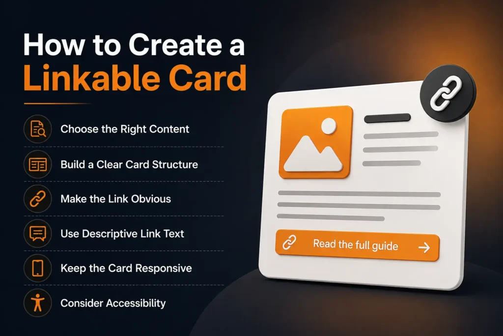
Creating a linkable card is mainly about combining useful content with clear navigation. The card should tell users what they will find, give them an obvious way to open it, and work naturally within the surrounding page.
Choose the Right Content
Start with the destination rather than the visual design.
Decide what page or resource the card should lead to. On a technology website, that could be a software review, AI guide, tutorial, product page, comparison, or another relevant article.
The card should provide enough context for users to understand why the destination is useful. A title such as “Best AI Coding Tools” is much clearer than a generic label such as “Read More.”
This also makes the component easier to scan when several cards appear together.
Build a Clear Card Structure
A simple structure is usually enough. Most linkable cards work well with a title, optional description, and optional image or icon.
The title should be the strongest visual element because it communicates the destination. A short description can explain what the linked page covers without repeating the title.
Images should support the content rather than take over the card. For example, a software-related card may use a product screenshot or recognizable visual, while a technical guide may work better with a simple icon or no image at all.
Keeping the structure consistent is particularly useful when cards appear in a grid. Users can then scan multiple destinations without having to learn a different layout for each card.
Make the Link Obvious
A linkable card should look and behave like something users can open.
One approach is to make the title the primary link and use the rest of the card as supporting content. Another approach is to make a larger portion of the card clickable while keeping a clear link in the HTML.
The underlying link should still use a normal <a> element with an href pointing to the destination. Google recommends this standard structure because it allows crawlers to discover and understand links reliably.
Avoid building navigation that depends entirely on a JavaScript click event attached to a generic <div>. It may behave like a link visually, but it does not provide the same semantic clarity as a proper HTML link.
Use Descriptive Link Text
The wording inside the card matters.
A link such as “AI Agent Development Guide” gives users a clear expectation of the destination. Phrases such as “Click Here” or “Learn More” offer very little context.
Google recommends descriptive, concise, and relevant anchor text because it helps both users and search engines understand the linked page.
The same principle applies to internal linking. A card linking to an existing article can help users discover related content while giving search engines another way to understand the relationship between pages. Google specifically recommends using relevant internal links to help people and search engines discover important pages on a site.
Keep the Card Responsive
A card that works only on a large desktop screen is not a good implementation.
The layout should adapt to smaller screens without making the title difficult to read or the clickable area difficult to use. In a grid, cards may move from several columns on desktop to fewer columns or a single column on mobile.
Images should also scale without distorting the card or creating unnecessary layout shifts.
The goal is simple: the same content and destination should remain easy to understand and access regardless of screen size.
Consider Accessibility
Accessibility should be part of the component from the beginning rather than an afterthought.
The link purpose should be understandable from its text or the surrounding context. Users navigating with a keyboard should also be able to reach and activate the link without relying on a mouse.
When an image itself functions as the link, its alternative text can provide meaningful information about the destination. Google notes that for image links, the image’s alt attribute can be used as anchor text, which makes descriptive alternative text important.
This does not mean every decorative image needs a long description. Decorative visuals should remain decorative, while informative images should communicate their relevant meaning.
Linkable Card SEO Best Practices
A linkable card does not need special SEO tricks. The important part is making the underlying link understandable, crawlable, and relevant.
Use a real HTML link with a valid destination URL. Keep the anchor text descriptive rather than filling it with repeated keywords. Make sure the linked page is relevant to the surrounding content.
For an image-based card, use an appropriate alt attribute. If the image is purely decorative and the title already provides the link meaning, the image may not need to carry additional information.
Internal link cards can also be useful for building logical connections between related pages. A technology blog, for example, could connect an article about AI agents with relevant guides on AI automation, AI tools, or agent frameworks. The relationship should make sense to the reader rather than being added simply to increase the number of internal links.
There is no fixed number of links that every page should contain. Google advises focusing on useful, contextual linking instead of trying to reach an arbitrary link count.
Common Linkable Card Mistakes
A few implementation choices can make cards less effective.
Making the entire card clickable can sometimes create confusing nested links when the card also contains separate links or buttons. Keeping the interaction model simple avoids this problem.
Another common mistake is using the same generic text on every card. If every card says “Read More,” users have to rely on the surrounding content to determine where each link goes. Descriptive titles solve this much more effectively.
Overloading cards with large images, excessive text, multiple buttons, and decorative effects can also reduce their usefulness. A linkable card should help users decide quickly, not become another page to read.
The best implementation is often the simplest one: clear content, a meaningful destination, a semantic link, and a layout that works across devices.
🧠 Deepen Your Knowledge: Understanding the Blockchain E-Commerce Platform
How Linkable Cards Support SEO and Content Discovery
A linkable card can contribute to SEO mainly through internal linking and better content discovery.
When a card points to another relevant page using a normal HTML link, search engines can discover that destination through the site’s link structure. Google recommends using crawlable <a> elements with an href attribute and descriptive anchor text so both users and search engines can understand the relationship between the current page and the linked page.
This is particularly useful on technology websites with a large number of related articles. A page about AI agents, for example, could use linkable cards to guide readers toward an AI automation guide, an AI agent framework comparison, or a related tutorial.
The important point is relevance. Adding cards to every page simply to create more internal links does not make the site better. Each card should help users discover something genuinely related to the page they are reading.
Linkable Card vs. Infographic
These two formats can look similar, but they serve different purposes.
An infographic is primarily designed to communicate information visually. It may contain statistics, processes, diagrams, or multiple related data points.
A linkable card is primarily a navigation component. Its purpose is to provide a concise preview and take the user to another page or resource.
An infographic can contain a link, but that does not automatically make it a linkable card. The difference is in the component’s role within the interface.
Linkable Card vs. CTA Card
A CTA card is designed to encourage a specific action, such as signing up, starting a trial, downloading a resource, or contacting a business.
A linkable card can be much less promotional. It may simply help users move from one article to another.
For a tech blog, this distinction is useful. A card linking to a related tutorial is primarily a content-discovery element, while a card encouraging visitors to try a SaaS product is a conversion-focused CTA.
Best Practices for Linkable Cards
A strong linkable card should make the destination understandable before the user clicks it. Keep the title specific, use descriptions only when additional context is useful, and avoid unnecessary visual elements.
The interaction should also remain predictable. If the whole card behaves as one link, users should not discover unexpected buttons or additional links inside it. Design systems differ in how they implement block links, but accessibility and clear link semantics should remain central to the implementation. The W3C Design System, for example, documents both cards with a distinct link and block-link patterns and warns against simply wrapping complex card contents inside one large anchor element.
For accessibility, the heading level should fit the structure of the surrounding page, keyboard users should be able to reach the link, and informative images should have appropriate alternative text.
Performance matters as well. A card grid containing large images can increase page weight unnecessarily, so images should be appropriately sized and optimized for the context in which they are displayed.
Above all, consistency matters. When cards follow the same layout and interaction pattern throughout a site, users can recognize them quickly and understand what to expect.
When Should You Use a Linkable Card?
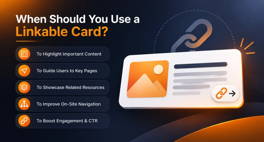
Linkable cards work best when a page has several related destinations that benefit from visual separation.
They are a natural fit for related articles, product categories, software collections, documentation sections, tutorials, resources, and featured content.
They are less useful when a single simple text link would communicate the same information more clearly. Turning every link into a card can make a page visually heavy and can reduce the importance of the genuinely useful destinations.
For a technology website, a good rule is to use cards where visual grouping improves content discovery. A section containing related AI guides may benefit from three or four consistent cards. A sentence linking to one supporting definition probably does not need a card.
The component should serve the content rather than the other way around.
Frequently Asked Questions
What is a linkable card?
A linkable card is a card-based web component that presents information and provides a link to another page or resource. It commonly includes a title and may also contain a description, image, icon, or other supporting content.
Are linkable cards good for SEO?
They can support SEO when they use crawlable links and connect users to relevant pages. Their main SEO value comes from useful internal linking and improved content discovery rather than from the card design itself. Google recommends descriptive, crawlable links that help users and search engines understand linked pages.
Should the entire card be clickable?
It depends on the design and content. A full-card link can provide a convenient interaction, but the implementation should remain accessible and should not create confusing nested links. Some design systems support the entire card as a link, while others use a distinct link within the card.
Can a linkable card contain an image?
Yes. Images are commonly used to give users additional visual context. They are optional, though, and should support the destination rather than exist purely for decoration. When an informative image functions as a link, its alternative text should accurately communicate its purpose.
What makes a linkable card effective?
A useful linkable card has a clear destination, descriptive content, predictable interaction, responsive design, and accessible markup. The strongest cards provide enough information to help users decide whether the linked resource is relevant without overcrowding the interface.
Conclusion
A linkable card is a simple but flexible component for connecting users with relevant pages and resources. Its strength comes from combining clear information with straightforward navigation.
For technology websites, these cards can be particularly useful for organizing related articles, guides, tools, software pages, and documentation. When implemented with semantic links, descriptive text, responsive layouts, and accessible interactions, they can improve both usability and content discovery.
The key is not to make every link look like a card. Use the component where visual structure genuinely helps users understand what is available and decide where they should go next.
🖇 Better knowledge. Better results. Follow Tech Statar.