
Key Takeaways
- Prioritize Clarity: Concise labels and logical grouping make navigation effortless.
- Maintain Consistency: Uniformity in design elements across the site increases trust and usability.
- Ensure Accessibility: Designing for all users strengthens inclusivity and legal compliance.
- Optimize for Mobile: Responsive, touch-friendly side menus adapt to different devices.
- Test and Iterate: Ongoing user feedback drives improvements in navigation structure.
Side navigation menus are a staple in web design, offering users a consistent and accessible way to explore content. When crafted thoughtfully, these menus improve usability and site navigation, enabling users to navigate content with confidence. A well-designed side navigation UI provides structure and makes it effortless to find important sections or features.
Navigation menus are especially important for websites with extensive content or complex structures. They provide an at-a-glance overview of available sections, keeping users oriented and enabling quick page navigation. Carefully constructed side menus can also encourage users to explore more of what your website or application has to offer, resulting in higher engagement and satisfaction.
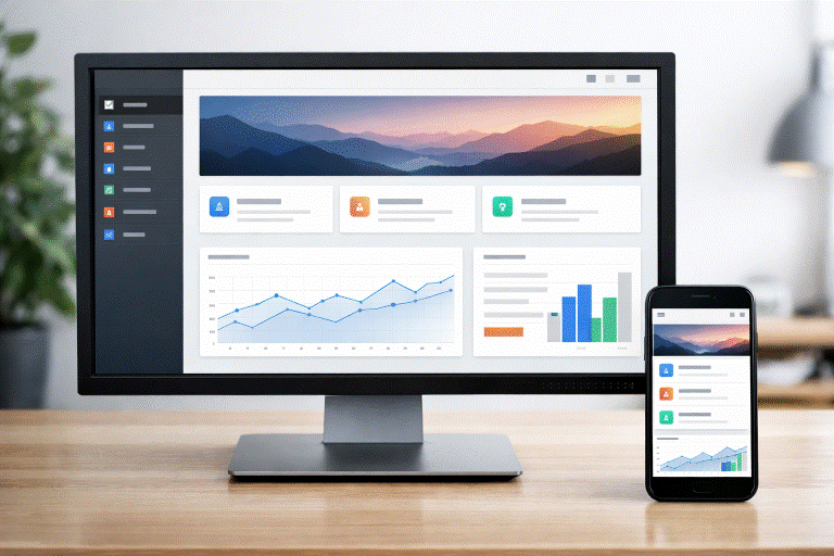
Across devices and screen sizes, a clear, organized side navigation ensures a seamless experience. As more users browse on mobile devices, adapting this interface element for smaller screens while prioritizing clarity is essential. Ultimately, crafting user-focused navigation balances great design with usability, accessibility, and responsiveness.
Understanding Side Navigation Menus
Side navigation menus appear vertically on the left or right edge of a webpage or application interface. Their structure offers users a familiar roadmap, especially on content-heavy platforms such as dashboards, documentation sites, or e-commerce catalogs. The vertical arrangement aligns with most users’ reading patterns and supports easy scanning, particularly as users move deeper into your site’s hierarchy.
Compared to top navigation, side menus comfortably handle larger numbers of links and categories, helping organize multi-level navigation without overwhelming the user.
Key Design Principles
1. Clarity and Simplicity
Clarity starts with easily understood structure and language. Use concise, well-known terms like “Dashboard,” “Profile,” or “Help.” Avoid jargon or ambiguous phrasing. Group related items beneath clear headings to establish hierarchy and aid user comprehension. An effective side navigation menu should never leave users wondering where to click next.
2. Consistency Across Pages
Consistent design elements build confidence and make a website feel cohesive. Ensure side navigation placement, spacing, fonts, colors, and icon styles are uniform across every page. This creates a predictable interface that makes navigation feel effortless while maintaining the brand’s visual identity.
3. Accessibility Considerations
Side navigation menus should be usable by everyone. Supporting keyboard navigation is fundamental, as some users cannot use a mouse. Screen readers should interpret navigation menus correctly, which means leveraging semantic HTML (such as the <nav> element) and ARIA labels when needed. Ensure adequate color contrast, avoid using color alone for meaning, and communicate focus states for interactive elements.
4. Mobile Responsiveness
Responsive design ensures your side navigation adapts to all screen sizes, with collapsible menus or “hamburger” icons on smaller screens to save space. Touch targets should be large enough to prevent mis-taps, and menus should slide smoothly, maintaining clarity. Considering speed and performance is crucial; lightweight code and minimal graphics help, especially on slow connections or older devices. Progressive enhancement ensures basic navigation always works, with extra features as bonuses. Icons and links must be easily tappable to support accessibility. Future designs should support gestures like swiping, but always with visible buttons, balancing modern features with intuitive use.
💚 You might also like: 5 Best Website Security Tools for Developers in 2026
Common Pitfalls to Avoid
1. Overloading the Menu
A menu with too many options overwhelms users and decreases usability. Prioritize the most important links and move secondary or infrequently used items to submenus or less prominent sections. This keeps navigation simple and direct.
2. Inconsistent Design Elements
Changes in font styles, colors, or iconography between pages can confuse users and make your site feel unprofessional. Adhere to a robust style guide for all navigational elements so users always know what to expect and can navigate confidently.
3. Neglecting User Feedback
Failing to listen to users’ needs can result in an ineffective navigation system. Regular usability testing with real users helps observe interactions, while analytics identify trouble spots and behavior patterns. Using this data to refine menus boosts engagement and navigation efficiency. Feedback channels allow users to share frustrations and suggestions, fostering loyalty and increasing conversions. Collaboration among design, development, and content teams ensures menus are clear, accessible, and align with branding, delivering a better user experience and bridging the gap between vision and actual needs.
Conclusion
Effective side navigation menus help users explore your digital products by emphasizing clarity, consistency, accessibility, and mobile responsiveness. Regular testing and user feedback ensure menus improve over time to meet evolving needs. In today’s digital world, providing a smooth, intuitive navigation experience can differentiate your site from competitors. Whether updating or creating anew, investing in strong side navigation boosts user retention, satisfaction, and business results. Remember, navigation is a continuous process that evolves as your site or app grows. Regular reviews and adaptability keep your side menu a valuable asset, improving usability and supporting long-term success.
✨ Want more clarity, less confusion? Follow Tech Statar.


")


