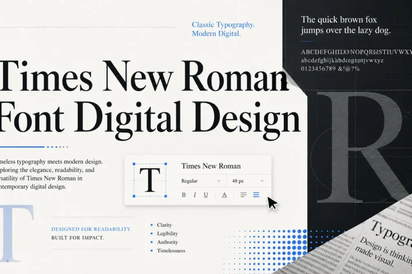

Why the Times New Roman Font Matters in Digital Design?
In the fast-moving world of digital design, typography trends change quickly. One year, designers are obsessed with geometric sans serifs. Next, everyone is using soft humanist fonts, expressive display type, or minimal editorial-style letterforms. Yet, among all these shifts, one classic typeface continues to hold a strong place in design conversations: Times New Roman.
Digital design is not only about looking modern. It is about communication. A typeface must support the message, guide the reader, create trust, and make content feel appropriate for its purpose. This is where Times New Roman still matters. It may not be the trendiest font on a landing page or the boldest choice for a tech startup logo, but it remains one of the most dependable typefaces for serious, text-heavy, and credibility-focused design.
A Typeface Built for Reading
Times New Roman was originally created for newspaper printing, which means it was designed with readability and space efficiency in mind. Newspapers needed a font that could fit a large amount of text into a limited space while still remaining clear and comfortable to read. That practical design purpose is one of the reasons the font has remained relevant for so long.
In digital design, the same principle still matters. Whether you are designing a blog, online magazine, legal document, academic resource, editorial website, or downloadable PDF, the reader’s comfort should come first. A beautiful design that makes reading difficult fails at its most important job. Times New Roman performs well because it has a strong rhythm, recognizable letter shapes, and balanced spacing.
Its serifs help guide the eye across lines of text. The contrast between thick and thin strokes gives the text a formal, polished appearance. The compact letterforms allow more words to fit naturally in a paragraph without making the layout feel crowded. When used correctly, Times New Roman creates a smooth reading experience, especially in long-form content.
Many modern fonts are designed to look stylish in headlines or app interfaces, but they can feel tiring in long paragraphs. Times New Roman, on the other hand, was built for continuous reading. That makes it useful even in today’s digital-first design environment.
💝 You might also like: Fontlu
Familiarity Creates Trust
One of the strongest advantages of Times New Roman is familiarity. Users have seen it for years in official documents, contracts, books, newspapers, academic papers, and business reports. Because of that, the font carries a sense of reliability. It feels serious, established, and professional.
In design, trust is not created only through colors, images, or layout. Typography plays a major role. A font can make a brand feel playful, luxurious, technical, artistic, or formal. This serif naturally communicates formality and credibility. When users see it in the right context, they immediately understand that the content is meant to be taken seriously.
This is especially important for industries where authority matters. Legal websites, educational platforms, financial documents, research-based content, and editorial publications can all benefit from the sense of trust that a classic serif brings. It tells the reader, “This information is important. Read it carefully.”
That does not mean every formal website should use the same old default styling. The real value comes from intentional design. With the right spacing, hierarchy, margins, and layout, a familiar typeface can look refined instead of boring.
Why Designers Still Use This Font?
Professional designers do not choose fonts only because they look new. They choose fonts based on purpose. A good typeface must match the message, audience, format, and emotional tone of the design. Times New Roman remains popular because it fulfills a specific design need: making content appear classic, legible, and trustworthy.
In a digital world filled with sleek sans-serif fonts, using a classic serif can create contrast and distinction. A brand that wants to feel editorial, intellectual, historical, or refined may intentionally choose a serif typeface to stand apart from the modern tech look.
For example, an online journal might use a modern sans-serif for navigation and interface elements, then use a traditional serif for article content. This combination creates a strong editorial feel. The sans-serif keeps the interface clean, while the serif adds depth and seriousness to the reading experience.
Designers often return to classic fonts because they have proven themselves over time. Trends come and go, but a typeface built on clarity and function continues to work. In that sense, it is not just an old font. It is a tested design tool.
When discussing traditional digital typography, many designers still reference times new roman because it remains one of the clearest examples of how a classic serif typeface can shape tone, readability, and visual trust in both print and screen-based design.
💝 You might also like: Clideo
Times New Roman in Editorial Design
Editorial design depends heavily on typography. The way a headline, subheading, caption, and body paragraph are styled can completely change how an article feels. Times New Roman has long been associated with newspapers, publishing, and formal writing, which makes it a natural fit for editorial-style digital projects.
In online articles, newsletters, essays, and long-form storytelling, this font can give content a thoughtful and established tone. It makes the page feel less like a quick social media post and more like a serious publication. This can be valuable for brands that want readers to slow down and engage deeply with the content.
The typeface also works well when paired with strong layout choices. Wide margins, clean spacing, balanced line height, and carefully sized headings can make it feel elegant rather than outdated. Many people think it looks boring because they have only seen it in default word processing documents. But when a designer handles it properly, it can look refined, classic, and intentional.
A good designer understands that the same font can feel weak or powerful depending on how it is used. Poor spacing, small font size, and tight margins can make any typeface look dull. But a classic serif used with generous whitespace, strong hierarchy, and thoughtful contrast can feel timeless.
It Still Works in Formal Digital Documents
Digital design is not limited to websites and apps. It also includes PDFs, reports, proposals, presentations, eBooks, resumes, whitepapers, contracts, and downloadable resources. In these formats, Times New Roman still has practical value.
Many professional documents need to be serious and easy to read. A business proposal, legal agreement, academic document, or investor report does not always need a trendy font. It needs clarity, structure, and credibility. This traditional serif provides all three.
Because it is widely available across systems, it also reduces compatibility issues. When a document is opened on different devices or software, the font is likely to display correctly. This makes it a safe choice for formal documents that need consistency.
Designers often talk about originality, but professional design also requires reliability. In many business and academic contexts, using an unusual font can create unnecessary friction. A familiar typeface keeps the focus on the content. It does not distract from the message, which is exactly what good typography should do in formal communication.
💝 You might also like: Designing Effective Side Navigation Menus
Typography and Brand Personality
Every font has a personality. Times New Roman feels traditional, serious, intellectual, and authoritative. That makes it suitable for certain types of brands and unsuitable for others.
A children’s toy brand probably should not use this kind of typeface as its primary identity font because the tone may feel too formal. A futuristic SaaS company might also avoid it because it may not communicate innovation strongly enough. But a law firm, university, publishing platform, historical archive, literary blog, consulting firm, or research organization could use it effectively.
The key is alignment. If the brand wants to communicate maturity, knowledge, and trust, a classic serif can support that message. If the brand wants to feel playful, experimental, or ultra-modern, another typeface may be better.
This is why professional designers do not label fonts as simply good or bad. A font is only right or wrong for a specific purpose. Times New Roman is not the perfect font for every digital design project, but it is still a strong choice when the design goal requires seriousness, tradition, and readability.
The Misunderstood Reputation of This Classic Serif
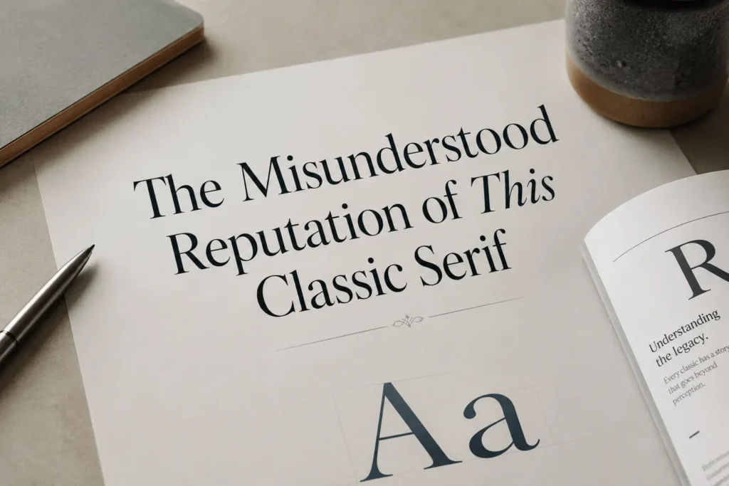
One reason this font is often criticized is that it has been overused as a default choice. Many people associate it with plain school assignments, boring reports, and unstyled documents. But that reputation is not entirely fair. The problem is not always the typeface itself. The problem is often lazy design.
Any font can look bad when used without intention. Poor spacing, weak hierarchy, tight margins, and generic formatting can make even a beautiful premium font look unprofessional. This classic serif suffers from familiarity because people have seen it used in the most basic way for years.
A professional designer looks beyond that surface-level reaction. The designer asks: What does this typeface communicate? Does it support the content? Does it improve readability? Does it match the audience’s expectations?
When used with intention, Times New Roman can feel classic rather than boring. It can create a mature visual tone. It can make a design feel grounded and trustworthy. The difference is in execution.
Pairing It with Modern Design Elements
One of the best ways to make this traditional font feel fresh in digital design is to pair it with modern visual elements. Typography does not work alone. It interacts with color, spacing, imagery, layout, and interface design.
For example, it can look excellent when paired with a clean sans-serif font for menus, buttons, and small interface labels. The contrast between serif and sans-serif creates a professional balance. The serif brings editorial character, while the sans-serif keeps the digital interface sharp and modern.
It can also work beautifully with minimal color palettes. Black text on an off-white background can create a refined reading experience. Deep navy, charcoal, cream, and muted earth tones can make the font feel premium and calm. Strong photography, elegant grid systems, and generous whitespace can also help the design feel more intentional.
The mistake is treating the font as a default instead of a design choice. When selected deliberately and supported by a thoughtful layout, it can still feel relevant and sophisticated.
🔷One post is never the full picture. Follow Tech Statar for the rest.


")


")


")


")


