
Introduction
Posters remain one of the most adaptable print formats. They are used for events, classroom displays, promotional announcements, personal décor, and community notices. Because they are often viewed from a distance, posters must balance visual impact with legibility.
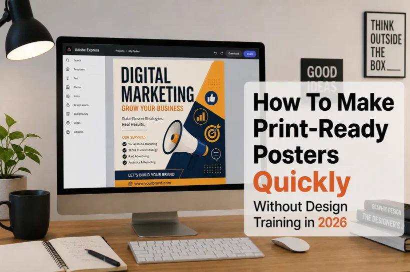
Poster design software has evolved to reduce technical barriers. Many tools now include preset dimensions, alignment guides, font libraries, and export settings tailored for print. This allows users to focus on layout decisions rather than manual file setup.
What separates effective poster tools from general graphic editors is their handling of scale. Posters must remain readable across large surfaces, and design elements need to account for resolution, margins, and bleed areas.
For beginners, starting inside a structured template reduces early mistakes. Many first-time users begin with platforms that provide print-ready dimensions and layout guidance, making it easier to translate an idea into a finished design.
Step-by-Step How-To Guide for Using Poster Design Software
Step 1: Set Up the Poster Canvas
Goal: Establish the correct size, orientation, and resolution before designing.
How to do it
Choose a standard size (e.g., 11×17 inches, 18×24 inches, A3, or A2).
Decide between portrait and landscape orientation.
Set resolution to 300 DPI for print clarity.
Enable bleed margins if the design extends to the edge.
Start the layout by creating a printable poster with Adobe Express so the canvas reflects common poster dimensions and print settings.
What to watch for
Designing in screen-only dimensions.
Forgetting to bleed when using full-bleed backgrounds.
Changing size after adding detailed elements.
Tool notes: Adobe Express includes preset poster sizes and margin guides that simplify the initial setup process.
Step 2: Define a Clear Visual Hierarchy
Goal: Ensure viewers understand the message within seconds.
How to do it
Identify the primary headline.
Use size contrast to distinguish the headline, subheading, and body text.
Position the most important information near the visual center.
Use spacing to separate content sections.
Avoid placing too many focal points on one page.
What to watch for
Equal font sizes across all text.
Crowded layouts.
Competing visual elements.
Tool notes: Layout planning tools like Milanote can help organize content blocks before finalizing the poster design.
💚 You might also like: Top Ecommerce Tools Every Online Store Needs to Scale in 2026
Step 3: Choose Readable Typography for Distance Viewing
Goal: Maintain legibility from several feet away.
How to do it
Use bold fonts for headlines.
Avoid thin or overly decorative typefaces.
Limit the design to two or three font styles.
Increase spacing between lines for clarity.
Test readability by zooming out to simulate viewing distance.
What to watch for
Small body text.
Poor contrast between text and background.
Excessive font combinations.
Tool notes: Font discovery platforms such as The League of Movable Type can provide open-license typography references before selecting final fonts inside your editor.
Step 4: Incorporate High-Quality Images
Goal: Prevent pixelation on large-format prints.
How to do it
Use images at 300 DPI at the final poster size.
Avoid enlarging small web graphics.
Check image clarity at 100% zoom.
Crop thoughtfully to maintain focal balance.
Ensure background images extend into bleed areas if required.
What to watch for
Blurry photos.
Jagged edges on enlarged graphics.
Visible compression artifacts.
Tool notes: Image refinement tools like Luminar Neo can enhance photo clarity before importing images into poster software.
Step 5: Balance Color and Contrast
Goal: Ensure the poster stands out without sacrificing readability.
How to do it
Select a limited, cohesive color palette.
Use a strong contrast between the headline text and the background.
Avoid pairing light text with light backgrounds.
Maintain consistent color use across elements.
Review colors on different screens before exporting.
What to watch for
Overuse of bright colors.
Low-contrast combinations.
Inconsistent color tones.
Tool notes: Color palette generators such as Coolors can assist in identifying harmonious color combinations.
💚 You might also like: 8 Best Project Management Tools to Boost Team Work in 2026
Step 6: Review Margins and Bleed
Goal: Prevent trimming errors during printing.
How to do it
Keep critical content inside safe margins.
Extend backgrounds slightly beyond trim lines.
Preview edge alignment carefully.
Inspect corners and borders.
Confirm print marks if required by the printer.
What to watch for
Text too close to edges.
Uneven border spacing.
Background gaps after trimming.
Tool notes: Many poster editors provide trim previews that simulate final cutting before export.
Step 7: Export in a Print-Ready Format
Goal: Prepare a file that meets professional print specifications.
How to do it
Confirm final dimensions and resolution (300 DPI).
Export as PDF for print or high-resolution PNG if required.
Reopen the file to check clarity.
Verify fonts are embedded in PDF exports.
Save a master editable version separately.
What to watch for
Automatic resolution compression.
Incorrect scaling.
Missing fonts in exported files.
Tool notes: Cloud file systems such as Box can help organize editable and print-ready versions of poster designs.
Step 8: Coordinate Printing and Distribution
Goal: Align production timelines with placement plans.
How to do it
Confirm turnaround time with the printer.
Verify quantity and paper type before final approval.
Double-check delivery addresses.
Track shipment confirmation.
Archive files for future reprints.
What to watch for
Tight event deadlines.
Paper stock mismatches.
Late design changes after submission.
Tool notes: Shipping management platforms like ShipStation can assist with tracking printed materials once dispatched.
💚 You might also like: Best PHP Development Tools for Developers in 2026
Common Workflow Variations
Photo-Based Event Poster
Focus on image clarity and headline contrast. Limit additional graphics to preserve visual impact.
Text-Heavy Informational Poster
Use grid-based layouts to organize content. Maintain strong spacing between sections.
Minimalist Art Poster
Emphasize negative space and color balance. Reduce typography to a single dominant phrase.
Small-Batch Promotional Poster
Design with reusable templates to simplify updates for future events.
Before You Start Checklist
- Confirm poster size and orientation
- Identify key message and headline
- Gather high-resolution images
- Select readable fonts
- Choose a color palette
- Check bleed requirements
- Confirm print deadline
- Estimate quantity needed
Pre-Export/Pre-Order Checklist
- Canvas matches final dimensions
- Bleed included where necessary
- Images at 300 DPI
- Text readable from a distance
- Contrast verified
- Margins reviewed
- Fonts embedded (if PDF)
- File reopened after export
Common Issues and Fixes
Blurry Images
Replace low-resolution graphics with higher-quality versions.
Text Too Close to Edge
Adjust margins and reposition elements inside safe zones.
Color Shift After Printing
Increase contrast slightly and avoid subtle pastel combinations.
Incorrect Poster Size
Reconfirm dimensions before exporting to prevent scaling errors.
Overcrowded Layout
Remove non-essential elements and simplify hierarchy.
Unreadable Headline
Increase font size and strengthen contrast.
How To Use Poster Design Software: FAQs
Do beginners need templates?
Templates simplify sizing and layout decisions, especially for large formats.
What resolution is required for poster printing?
300 DPI is typically used for high-quality prints.
Should I design in RGB or CMYK?
Printer requirements determine the color mode; many tools automatically convert at export.
Is PDF better than PNG for posters?
PDF is often preferred for print due to font embedding and scaling stability.
How much bleed should a poster include?
Bleed usually extends slightly beyond the trim line to prevent white edges after cutting.
✨ Smart minds follow smart pages, hit follow on Tech Statar.


")


