
Pxless: The Evolution of Pixel-Free Design
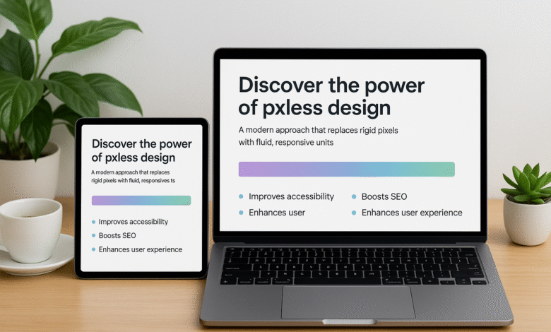
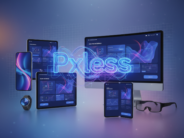
Digital design is changing faster than ever. From high-resolution monitors to foldable smartphones, screens are becoming more diverse, adaptive, and unpredictable. Amid this transformation, a new philosophy has emerged, pxless.
At its core, pxless represents a movement away from rigid, pixel-based design toward a flexible, adaptive model that responds gracefully to any screen size or device. It’s a design approach built for the modern era, one where creativity meets accessibility, and consistency meets adaptability.
The idea is simple: if pixels are no longer the unit of truth, what replaces them? The answer lies in fluid layouts, scalable typography, and relative units that redefine how we think about digital experiences.
What Exactly Is Pxless?
The term pxless combines “px” (the shorthand for pixel) and “less,” symbolizing a philosophy that goes beyond fixed-pixel design. Traditionally, designers relied on pixel-perfect mockups, exact dimensions, fixed element spacing, and static layouts.
While this approach worked in the early web era, it became increasingly limited as devices diversified. Today, with thousands of screen sizes, aspect ratios, and resolutions, pixel-fixed designs simply can’t keep up.
Pxless design embraces a fluid and dynamic philosophy. It uses relative units like percentages, ems, rems, and viewport widths (vw/vh) instead of static pixel measurements. The result is an interface that adapts seamlessly, scaling typography, spacing, and components proportionally to any device. In essence, pxless is not just a design technique, it’s a mindset that prioritizes user experience over visual rigidity.
How the Concept of Pxless Evolved
The seeds of pxless thinking were planted years ago with the rise of responsive web design. When Ethan Marcotte introduced the concept in 2010, designers began to shift from fixed layouts to fluid grids. But even responsive design often depended on pixel-based breakpoints, 320px, 768px, 1024px, and so on.
The next evolution came with relative units and fluid typography, which made layouts more organic. Modern CSS tools such as Flexbox, Grid, and container queries further enabled developers to build truly responsive interfaces, ones that flow naturally rather than snap abruptly at breakpoints.
Today, pxless design represents the culmination of these ideas. It’s the vision of a web (and digital ecosystem) that’s no longer bound by fixed dimensions, a space where adaptability, inclusivity, and scalability define good design.
Why Pxless Matters in Modern Design
Device Diversity
With users accessing content on everything from 6-inch smartphones to 32-inch monitors, pixel-based design fails to scale. Pxless ensures consistent readability and usability across all devices without manual pixel tweaking.
Accessibility
Accessibility isn’t a bonus, it’s a requirement. Designs that rely on pixels often ignore users who zoom or use larger font settings. A pxless approach respects user preferences and ensures visual harmony, no matter how the content is resized.
SEO and Performance
Search engines reward mobile-friendly, responsive, and lightweight sites. By removing pixel dependencies and embracing flexible structures, pxless designs reduce unnecessary CSS overrides and increase loading efficiency, resulting in better performance and SEO rankings.
Future-Readiness
New devices are constantly emerging, foldables, wearables, and AR/VR displays. Building with pxless principles prepares designers for a future where layouts must adapt automatically, even to screens that don’t yet exist.
You might also like “App Development for Startups with Garage2Global“
Core Principles of Pxless Design
To truly embrace pxless design, creators must think differently about how they define space, hierarchy, and structure. Below are the foundational principles that guide pxless methodology.
Relative Units Over Fixed Pixels
Instead of defining a button width as “200px,” define it as “50%” of its parent container. Typography can scale using “em” or “rem,” allowing it to grow naturally as the base font size changes. This ensures consistent proportion and readability.
Fluid Grids and Flexible Layouts
Pxless design relies on CSS Grid and Flexbox to create layouts that automatically adjust. With tools like minmax() or auto-fit, designers can build interfaces that stretch, shrink, and reorganize fluidly based on screen space, without pixel-locked breakpoints.
Fluid Typography and Spacing
Fonts should scale proportionally. Modern CSS functions like clamp() allow designers to set minimum, preferred, and maximum font sizes, ensuring perfect legibility across any device.
Design Systems and Tokens
A pxless design system relies on design tokens rather than hardcoded pixels. Tokens define spacing, sizes, and colors in relative terms, ensuring visual consistency and effortless scalability across platforms.
Pxless vs. Traditional Pixel-Based Design
| Aspect | Pixel-Based Design | Pxless Design |
| Unit | Fixed px values | Relative units (%, rem, em, vw) |
| Responsiveness | Needs manual breakpoints | Naturally fluid |
| Accessibility | Can break at zoom or large text | Scales automatically |
| Maintenance | High (requires per-device adjustments) | Low (flexible by default) |
| Future-Proofing | Limited | Highly adaptive |
The contrast is clear: while pixel-based design offers precise control, pxless design prioritizes usability and scalability. In a world where devices evolve faster than design standards, flexibility beats precision.
Real-World Benefits of pxless
Design teams that adopt pxless principles often report improvements in multiple areas:
- Faster Development: Flexible layouts require fewer manual tweaks.
- Better User Experience: Content always fits, regardless of device.
- Consistent Branding: Fluid systems maintain visual identity across breakpoints.
- Reduced Maintenance: Once a pxless system is in place, adapting to new devices or screen types is effortless.
- Improved SEO: Responsive, lightweight pages perform better and load faster.
In short, pxless is both a user-centric and performance-centric evolution.
The Psychological Shift: From Perfection to Adaptability
One of the biggest challenges in adopting pxless isn’t technical, it’s psychological. Designers have long been trained to chase pixel-perfect layouts. However, in today’s multi-device world, pixel perfection is an illusion.
The new metric of excellence is consistency in experience, not pixel alignment. Pxless design forces teams to think more strategically: What truly matters is not whether the layout looks identical everywhere, but whether it feels intuitive and usable across all environments.
Transitioning Toward a Pxless Mindset
Becoming pxless doesn’t require abandoning everything you know, it’s about gradual evolution. Start by auditing your current design system:
1. Identify where fixed px values dominate (e.g., padding, font sizes, breakpoints).
2. Replace them with relative units or scalable tokens.
3. Use modern CSS features like Flexbox, Grid, and clamp() for flexibility.
4. Test across devices and browsers to refine proportional behavior.
The more you experiment, the more you’ll understand how freeing it feels to design without pixel limits.
You might also like “How To Start a Tech Blog? Detailed Guide (2025)
Implementing Pxless: From Concept to Practice
The shift from pixel-dependence to pxless flexibility doesn’t happen overnight. It requires new tools, workflows, and a fresh mindset about what defines good design. Let’s break it down step by step.
Conducting a Pxless Audit
Before implementing pxless, evaluate where your current design system relies on pixels. This process, known as a pxless audit, helps you identify opportunities for fluid scaling.
Start with these key areas:
Typography: Replace static pixel font sizes with scalable units (em, rem, or clamp() functions).
Spacing: Convert fixed paddings and margins to relative percentages or em-based units.
Container Sizes: Swap hardcoded widths (e.g., 1200px) for flexible CSS Grid or Flexbox rules.
Breakpoints: Instead of strict pixel values, explore container-based queries or fluid design ranges.
The audit phase clarifies how deeply your current design depends on pixels, and where you can inject pxless flexibility without breaking layout structure.
Building a Pxless Foundation
Once the audit is complete, you can begin rebuilding your design system using pxless-friendly foundations.
Define Design Tokens
Start by defining design tokens, variables that control design values like spacing, font size, and color. Instead of storing values in pixels, use relative units or ratios. This ensures your design system scales naturally across screens, with no need for pixel recalculations.
Use CSS Grid and Flexbox
Pxless design thrives on modern layout technologies:
Flexbox handles single-axis layouts that automatically distribute space.
Grid manages two-dimensional layouts, letting elements resize proportionally.
Combined, they replace fixed pixel containers with fluid, responsive patterns.
Implement Fluid Typography
Typography defines readability, and pxless design makes it scalable. CSS’s clamp() function allows you to set font sizes that grow smoothly between min and max boundaries:
This eliminates the need for separate font-size breakpoints and creates text that feels perfectly balanced on every screen.
Best Practices for pxless Implementation
Think in Ratios, Not Numbers. Instead of thinking “this button should be 200px,” think “this button should take up 25% of the container width.” Pxless design is about proportional relationships.
Design Mobile-First:
Build layouts that expand rather than shrink. This aligns perfectly with the pxless mindset, fluid, scalable, and lightweight.
Use Container Queries Over Breakpoints:
Traditional breakpoints use device-based pixel widths. Container queries respond to the parent element’s space, a major step toward pxless precision.
Leverage Modern Tools:
Tools like Figma’s auto-layout, CSS variables, and responsive components simplify pxless workflows. Focus on components that scale automatically rather than fixed artboards.
Overcoming Challenges in Pxless Design
While pxless brings flexibility and long-term benefits, it also introduces short-term challenges for designers and developers used to pixel precision.
The Learning Curve
Designers transitioning from pixel-perfect workflows may initially find pxless unpredictable. The key is to embrace relative thinking: designing relationships, not measurements.
Consistency Across Devices
While pxless ensures adaptability, it can also produce unexpected visual differences across devices. Solve this by:
Establishing minimum and maximum limits using clamp()
Testing extensively on various devices and browsers
Using fluid grids that preserve proportions, not exact pixel values
Team Alignment
If developers and designers work with different assumptions (pixels vs. relative units), inconsistencies arise. Create documentation and style guides that clearly define pxless conventions, spacing, scaling, and typography.
Stakeholder Resistance
Some clients or managers still expect “pixel-perfect” designs. Educate them with examples showing how pxless improves performance, accessibility, and user satisfaction. Over time, results speak louder than pixels.
Real-World Examples of Pxless in Action
Many modern companies have already embraced pxless thinking, often without explicitly calling it that.
Figma & Responsive Components
Figma’s auto-layout and responsive resizing features allow components to adapt naturally, a pxless principle in practice. Designers define relationships, not fixed numbers.
Google’s Material Design 3
Google’s latest design evolution relies heavily on dynamic color, fluid grids, and responsive type scaling, echoing the essence of pxless design.
Apple’s Human Interface Guidelines
Apple promotes adaptable spacing and scalable type systems for macOS and iOS, moving away from pixel rigidity toward flexible, device-agnostic layouts.
These examples highlight that pxless isn’t a trend, it’s the quiet standard driving the world’s most advanced digital ecosystems.
Measuring Pxless Success
To ensure your pxless transformation is paying off, track measurable outcomes:
| Metric | What It Measures | Why It Matters |
| Page Load Time | Faster pages mean less CSS recalculation | Improves SEO ranking |
| Bounce Rate | How long users stay on your site | Indicates better adaptability |
| Accessibility Score (Lighthouse) | Compliance with zoom/text scaling | Reflects inclusivity |
| Device Testing Results | Layout performance across devices | Confirms pxless stability |
When executed well, a pxless design system enhances all of these metrics simultaneously, user satisfaction, accessibility, and SEO visibility.
You might also like “Newtopy: The Future of Meaningful Innovation and Community“
Future Trends in Pxless Design
The pxless movement aligns with broader trends reshaping the future of web and interface design.
Container Queries
A game-changer for pxless design. Container queries allow components to adapt based on their parents’ available space, not the entire viewport. This gives granular control without reverting to pixel-based breakpoints.
Design Tokens and Theming
As design systems mature, tokens are becoming the standard way to define scalable, reusable design variables. Pxless will continue to integrate deeply with token-based architecture.
Variable Fonts and Dynamic Typography
Variable fonts can adjust weight, width, and size dynamically, giving designers complete control over responsiveness without multiple static assets.
AI and Smart Layouts
AI-powered design tools are starting to predict optimal spacing, layout, and scaling. Pxless architecture provides the foundation for such automation.
Beyond Screens
Pxless design philosophy extends to wearables, AR, and immersive interfaces. As design moves into 3D and spatial environments, adaptability, not pixels, becomes the real metric of excellence.
How to Get Started Today
Here’s a simple roadmap to start your pxless journey:
– Audit your website or product, find pixel-locked areas.
– Replace pixel values with relative or viewport-based units.
– Implement design tokens for spacing and typography.
– Test on multiple devices using browser dev tools or responsive testers.
– Educate your team, share documentation on pxless standards.
– Measure improvements with SEO, accessibility, and UX metrics.
The earlier you start, the faster your product becomes future-ready.
You might also like “How to Edit HomeSmart Website Builder (A Step-by-Step Guide)
The Future is Pxless
Pixels once defined the web. Today, flexibility defines success. A pxless approach empowers designers to create experiences that adapt to every device, every user, and every environment, without compromise. It aligns technology, design, and user experience under a single philosophy: freedom from fixed dimensions.
By embracing pxless, brands not only prepare for the future, they shape it. And in a world that’s constantly changing, adaptability isn’t optional, it’s the new competitive advantage.
Conclusion
The pxless philosophy redefines how we measure design success. No longer are we bound by exact pixel counts or device breakpoints. Instead, we design for adaptability, inclusivity, and user comfort. For businesses and creators alike, pxless isn’t just a design trend, it’s a strategic advantage that ensures long-term relevance in a multi-device world.
So, the next time you open your design tool or write CSS, ask yourself: Am I designing for pixels, or for people? If it’s the latter, you’re already thinking pxless.
Want more topics like this? Hit follow on Tech Statar.


")


